I was asked to make a short title sequence for a project from the mind of Kenneth Pilo. Bold Me will be a place for inspiration and mind tickling short interviews, film and more in the fields of creativity.
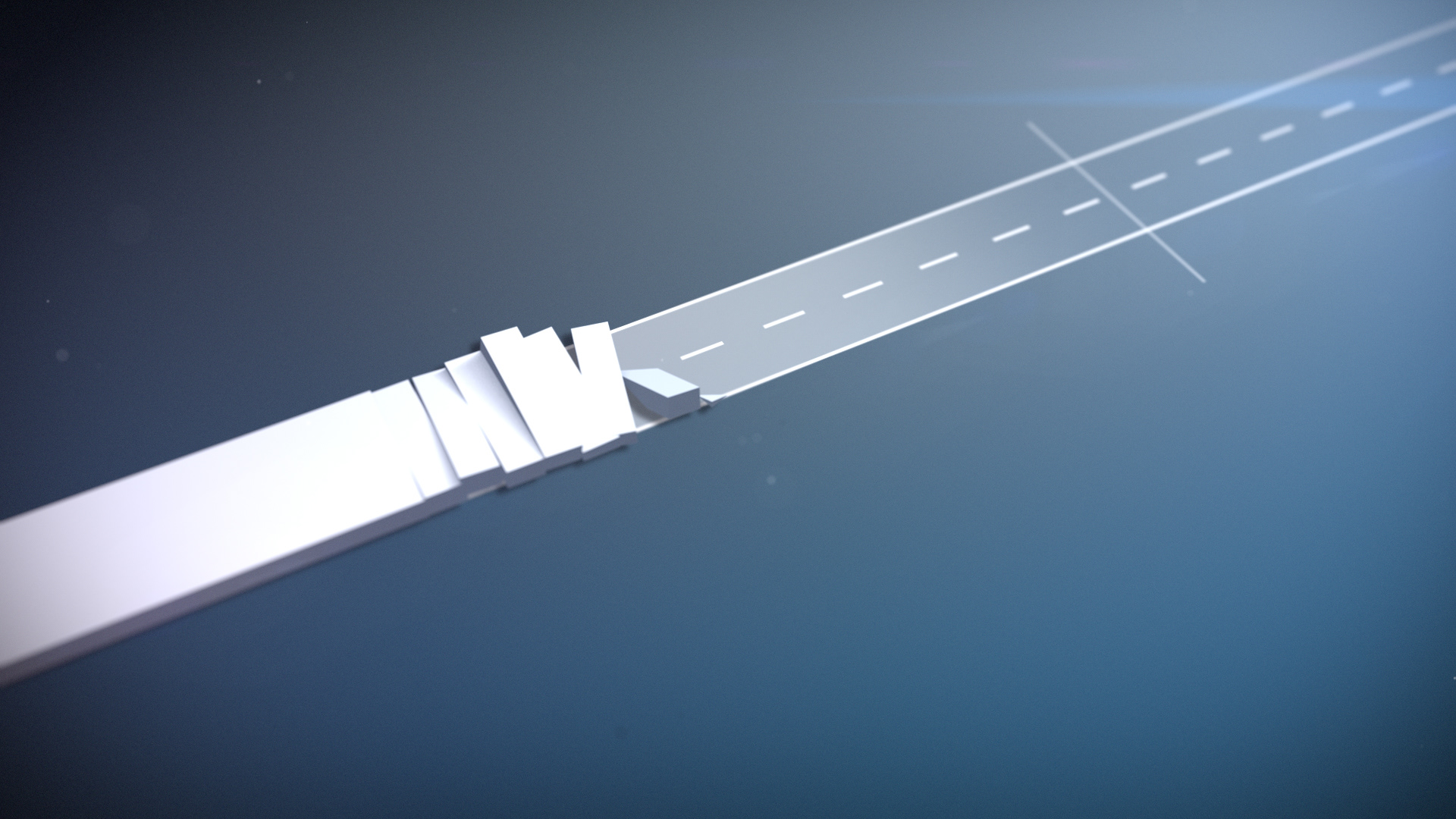
Pilo does a lot of design work so the idea for the sequence was to be crispy, elegant but still some rough edges. Inspired be the process of designing logos and typefaces. The typefaces used are designed by Pilo and among others Ray Larabie which can be found at veer.com. The name? Why of course - Pilo Thin and Pilo Regular.
Be sure to check him out:
www.bold.me
www.pilo.se